
Archet, a serif written as gestures
Its italic is drawn stroke by stroke and joins its letters. A repeated letter, the start of a word and the end of a word each take their own form.
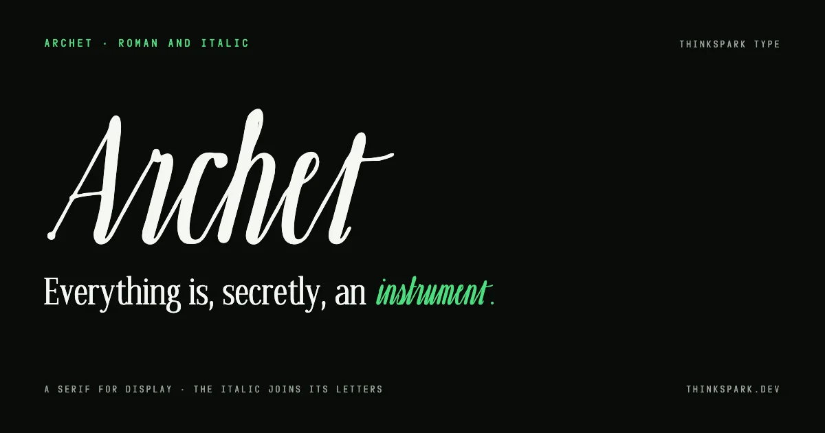
Archet is a display serif drawn in the studio. We started it on 26 October, after studying Instrument Serif, a narrow display face with a vertical axis, fine bracketed serifs and ball terminals. We measured its proportions and drew every letter again; no outline was taken from it.
The roman
The roman has 182 glyphs: the alphabet in both cases, figures, punctuation and the Western European accents. Six capitals, E, G, K, Q, R and W, have a second, more unusual form. The plain one is the default, and the other sits in stylistic set 1.
The italic
The italic is not drawn as outlines. Each letter is a gesture, the path of a pointed pen with its pressure, and Fontista's Liquid lab turns that path into ink. The lowercase letters join, and so do several capitals.
Handwriting rarely repeats itself, so each joined letter has four more forms: one for a letter that comes again close by, one for the start of a word, one for the end of a word, where the last stroke flicks out, and one for a word of a single letter. The font picks them by itself as the text is set.
Next
Both styles were proofed glyph by glyph in Fontista Control, our free proofing tool, over several passes. The spacing and kerning of the italic capitals are still in progress.