
Vorst, a geometric display family in ten styles
A lettering drawn in 2013 for a series of record sleeves, redrawn from scratch as a family of five weights and their obliques, named after Forest, a commune of Brussels.
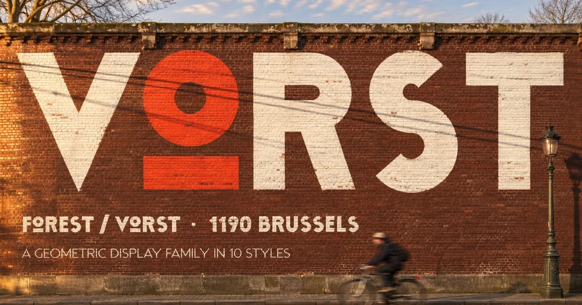
Vorst started in 2013 as the lettering of a series of record sleeves. This year we redrew it from scratch, letter by letter, on one rule: a single stroke, true circles, cuts made along the radius. It is now a family of ten styles.
The name is Dutch for Forest, one of the nineteen communes of Brussels: an abbey village until 1796, then railway lines, breweries and car factories near the Gare du Midi. The letters have the same plain, solid build, made to be read from across the street.
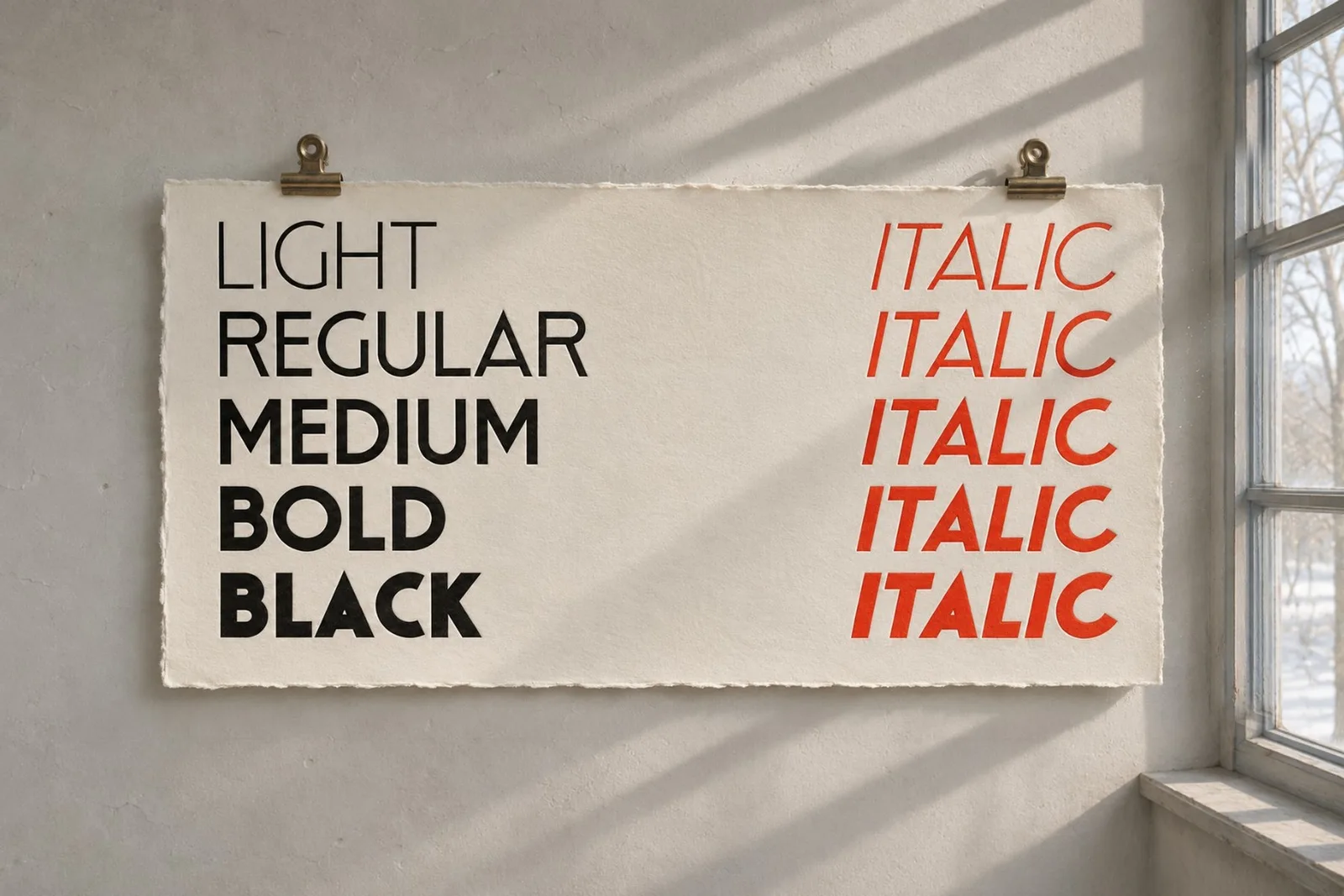
Five weights, five obliques
Light, Regular, Medium, Bold and Black, each with its oblique. The circles stay round in every weight, and the cuts keep their angle.
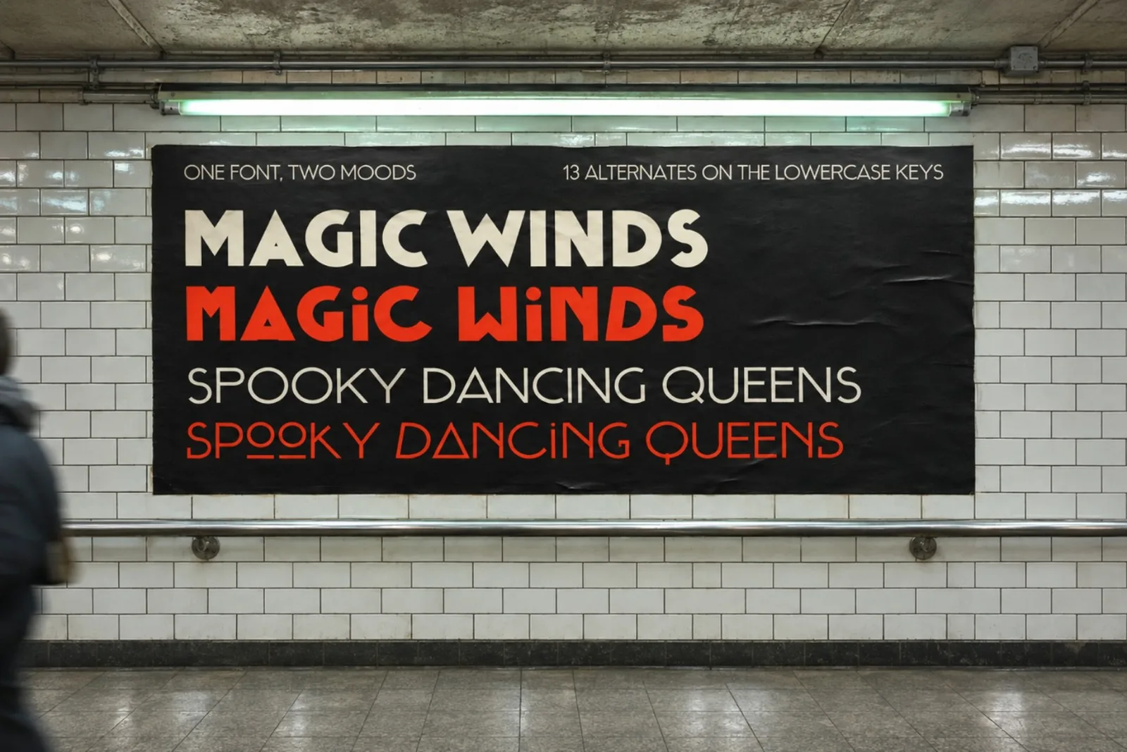
Two moods in one font
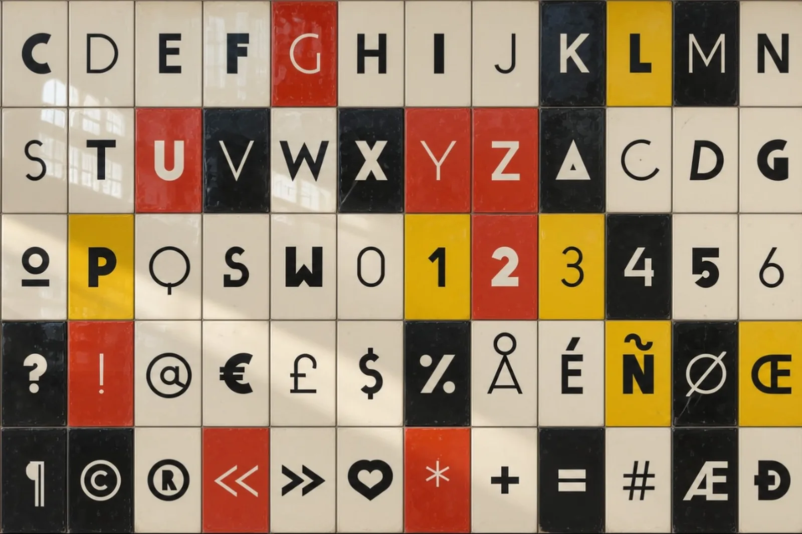
The capitals are on the uppercase keys. The lowercase keys hold thirteen alternates: a triangle A, a long C, a leaning D, an underlined O, among others. Type in lowercase and the same word changes mood.
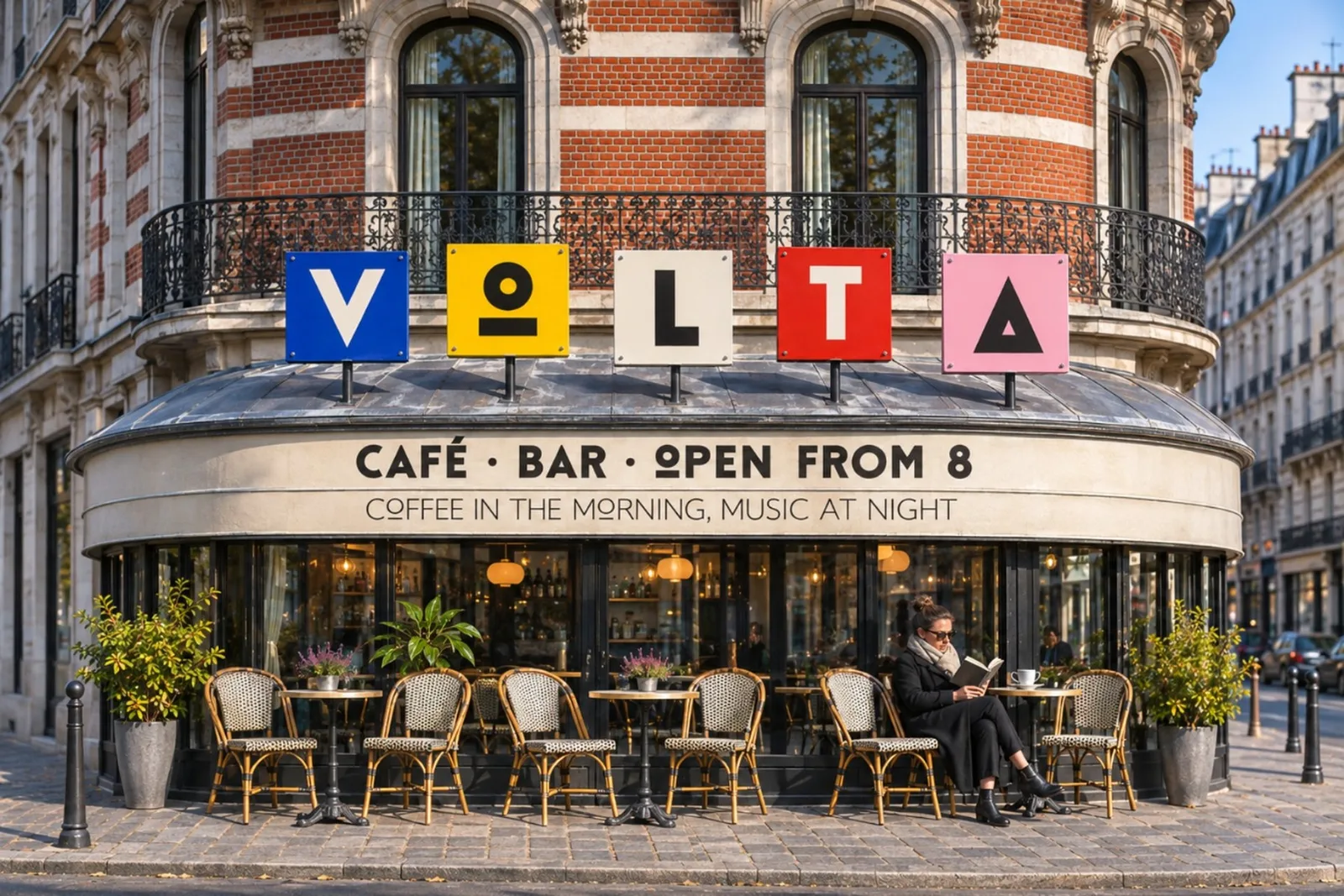
Ten stylistic sets go further, each listed by name in your applications: a barred S, a G with a foot, a round G, centred bars, the original R and J of 2013, a cross T, a U and a V with a stem, a round-corner L, and currencies with a single bar.
432 characters a style
Every style covers Latin-1, Windows-1252 and Latin Extended-A, so it also sets Polish, Czech, Turkish and Icelandic. Fractions, superiors and inferiors are built in.
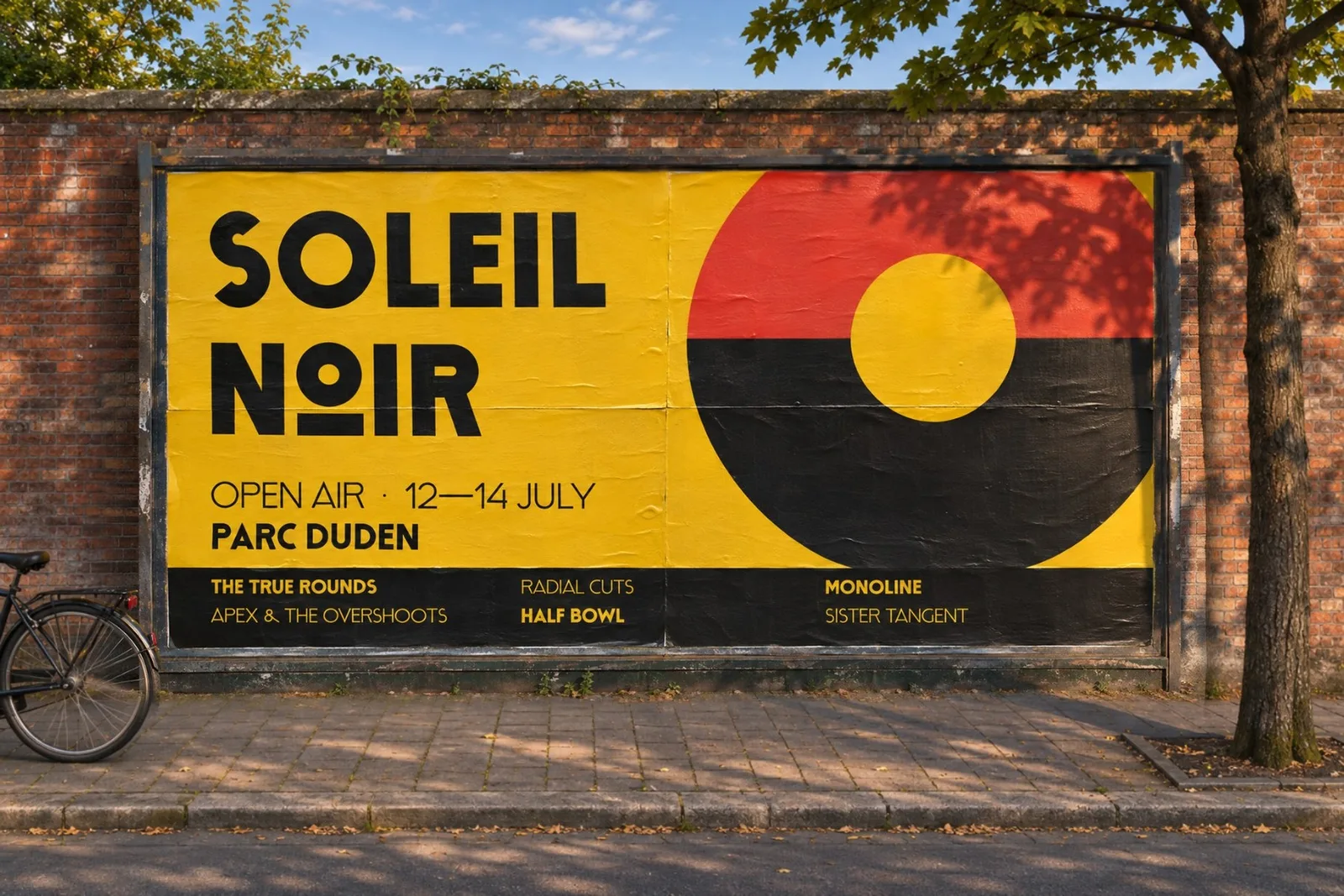
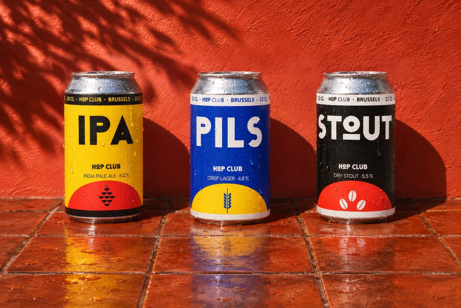
Vorst is made for shop fronts and painted walls, packaging, festival posters, record sleeves, menus, team shirts and signage: anywhere a name has to be written large, across the whole width.
It is on Sell at 9 € a style and 29 € the family, and on Creative Market. You can also try it in the type case on the home page.